

ERINA brand's design strategy
- Erina Domingo

- Nov 4, 2020
- 2 min read
Updated: Nov 24, 2020
Insight into the brand, target market and target customer leads to brand identity, by establishing a set of attributes and visual symbols through shape, color, logo and font style (Hameide 2011) Brands rely on emotional appeal.
Color
In marketing colour is a very important tool. Colours are used to attract new customers that identify the brand (Ridgway & Myers, 2014). Colours are also referred as the silent salesman (Hynes, 2009). Colours play a crucial role in determining a brands message, considering how colour makes people feel (Hameide 2011). This brand’s colour has been decided after establishing its personality and its verbal tone and ways it can connect with its target customer. The colour black is timeless, elegant and sophisticated, and has sense of luxury. It connotes seriousness and has a powerful force making it stand out. Blacks effect on the eye gives an irresistible visual appeal and makes it look sharp.
Font
Credited with creating first impression, fonts are classified to unique typographical features like the san’s serif and serif (Shaikh A.D, Chaparro B.S, & Fox D, 2006). Typography is the art of selecting and using appropriate style of type or a font that reinforces a message of words without distraction. Different font carries different connotations and can influence readability, assimilation, interpretation and its impact of words and concept it represents (Healey,2010.) This brand uses the font belonging to Sans Serif Yu Gothic UI and Plaza, where the letter has smooth edges, which means it does not have the feet as in Serif fonts making it look clean and gives it a modern feel and is clear and legible.
Logo
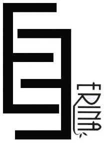
Hynes (2009) describes a logo as a badge of identification, as a mark of quality increasing company’s reputation. A good logo allows customers identify a product. A well-designed fashion logo can impact a brand perceived value. In the fashion world, logos have stood the test of time having two characteristics, they are simple and have unique design. This brand has designed a logo in level with luxury designer brands using fonts and colour to create a logo.
Erina brand designed a monogram logo using the initials of the designer’s name Erina Menezes. The letters E is used twice, one being flipped to resemble letter M and the name Erina is added next to the M. This logo is sleek, has a modern timeless feel. Keeping it simple is the key to get noticed.


Comments